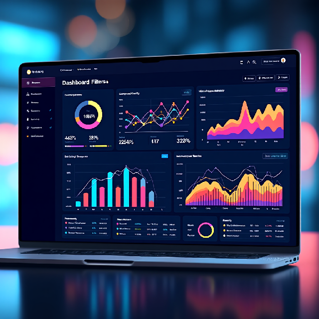
The Power of Interactive Dashboards in Business Intelligence
Interactive dashboards have become a cornerstone in today’s data-driven world. These tools are not just static representations of information; they are dynamic gateways to insights that empower businesses to make informed decisions swiftly and effectively. By offering real-time visualizations, drill-down capabilities, and intuitive filtering options, interactive dashboards allow users to explore complex datasets with ease, uncover hidden trends, and drive strategic choices with confidence.
What Makes Interactive Dashboards Unique?
Interactive dashboards are distinguished by several key features that set them apart from traditional reporting tools:
-
Customization: Users can tailor dashboards to focus on specific data points or visualizations, making them highly adaptable to different needs and roles. For example, a marketing team might prioritize KPIs like website traffic and conversion rates, while a finance team could focus on revenue metrics and expense analysis.
-
Real-Time Data: Many dashboards provide up-to-the-minute updates, allowing for timely decision-making in fast-paced environments. This is particularly crucial in industries such as healthcare, where real-time data can inform critical decisions that impact patient outcomes.
-
Drill-Down Capabilities: Interactive elements like filters, slicers, and drill-down features empower users to dive deeper into the data, revealing detailed insights that might otherwise go unnoticed. For instance, a retail dashboard might allow users to view sales performance at a regional level before drilling down to individual stores or product lines.
-
Enhanced Decision-Making: By presenting complex information in an intuitive format, interactive dashboards help users make sense of large datasets quickly and effectively. This is achieved through the use of charts, graphs, and other visual elements that simplify data comprehension.
Why Are Interactive Dashboards Essential?
The importance of interactive dashboards extends across various industries, offering numerous benefits:
-
Dynamic Data Analysis: Unlike static reports, interactive dashboards facilitate hands-on exploration, enabling users to ask questions, test hypotheses, and uncover new insights. This interactivity fosters a deeper understanding of the data.
-
Improved Collaboration: Shared dashboards provide a common interface for teams to align on goals, track progress, and respond to changes collectively. They serve as a central hub where stakeholders can access the same information, promoting alignment and reducing miscommunication.
-
Cross-Industry Applications: From healthcare analytics to financial performance tracking, interactive dashboards are versatile tools that cater to diverse needs across industries. Their adaptability makes them invaluable for organizations seeking to leverage data effectively.
Examples of Interactive Dashboards in Action
To illustrate the versatility and impact of interactive dashboards, let’s explore a few real-world applications:
-
Healthcare Monitoring: Track patient outcomes, disease trends, and treatment efficacy with real-time visualizations that inform critical decisions. For example, a dashboard might display infection rates across different hospital wards, allowing healthcare professionals to allocate resources more effectively.
-
Retail Performance: Analyze sales trends, customer behavior, and inventory levels to optimize operations and enhance profitability. A retail dashboard could provide insights into which products are performing well in specific regions, guiding restocking decisions.
-
Environmental Insights: Visualize climate data, monitor resource usage, and explore scenarios to support sustainability efforts. An environmental dashboard might show real-time energy consumption patterns across different cities, helping policymakers identify areas for improvement.
Implementation Steps: Building Your Own Interactive Dashboard
Creating an interactive dashboard involves several steps, each crucial to ensuring the final product is both functional and user-friendly:
-
Data Preparation:
- Organize your data hierarchically (e.g., Region > Country > State > City) to support drill-down capabilities.
- Ensure your dataset includes necessary fields for filtering.
-
Choose the Right Library or Tool:
- For JavaScript: Use libraries like D3.js, Plotly.js, or Chart.js for creating interactive charts.
- For Python: Utilize libraries such as Bokeh, Plotly, or Dash for building dashboards with interactive components.
-
Implement Filters:
- Create dropdowns or checkboxes for each level (Region, Country, etc.) using UI frameworks like React, Angular, or simple HTML/CSS and JavaScript.
- Use event listeners to capture user selections and update the dashboard accordingly.
-
Dynamic Visualization Updates:
- Write functions that filter data based on selected criteria and redraw or update charts dynamically.
- For example, when a Region is selected, populate the Country dropdown with relevant options and update the visualization to show Region-level data.
Examples of Implementation
JavaScript with D3.js
// Sample D3.js code for updating a bar chart based on filter selection
d3.select("#region-filter").on("change", function() {
var selectedRegion = this.value;
// Filter data and update chart
updateChart(filteredData);
});

function updateChart(data) {
// Update the bar chart with new data
bars.data = data;
bars.enter().append("rect");
bars.enter()
.attr("x", function(d) { return x(d.label); })
.attr("width", x.bandwidth())
.attr("height", 0)
.attr("y", height);
bars.transition()
.duration(1000)
.attr("height", function(d) { return height - y(d.value); });
}
Python with Plotly and Dash
import dash
import dash_core_components as dcc
import dash_html_components as html
from dash.dependencies import Input, Output
import plotly.express as px

# Create a sample DataFrame
df = pd.DataFrame({
"Region": ["North", "South", "East", "West"],
"Country": ["USA", "Canada", "Mexico", "Brazil"],
"Sales": [100, 200, 300, 400]
})

# Initialize app
app = dash.Dash(__name__)

# Create a figure
fig = px.bar(df, x="Region", y="Sales")

# Layout
app.layout = html.Div([
html.H1("Sales Dashboard"),
dcc.Dropdown(
id="region-dropdown",
options=[{"label": r, "value": r} for r in df["Region"].unique()],
value=df["Region"].iloc[0]
),
dcc.Graph(id="sales-graph", figure=fig)
])

# Update graph based on dropdown selection
@app.callback(
Output("sales-graph", "figure"),
[Input("region-dropdown", "value")]
)
def update_graph(selected_region):
filtered_df = df[df["Region"] == selected_region]
return px.bar(filtered_df, x="Country", y="Sales")

# Run the app
if __name__ == "__main__":
app.run_server()
Best Practices for Effective Dashboard Design
- Optimize Data Handling: Ensure quick updates, especially with large datasets, by using efficient data structures and caching where possible.
- Provide Clear Visual Feedback: During filtering processes, provide indicators like loading spinners or progress bars to inform users that changes are being applied.
- Enhance User Experience: Use intuitive designs and minimalistic layouts to avoid overwhelming users with too much information at once.
Further Reading
For those interested in diving deeper into the world of interactive dashboards, here are some recommended resources:
- Data Visualization Best Practices: Explore how to choose appropriate chart types and ensure accessibility.
- User Testing Methodologies: Learn about techniques like A/B testing and card sorting to enhance usability.
- Real-Time Analytics Integration: Discover how tools like Kafka and AWS Kinesis can be used for real-time data streaming.
By following these steps and best practices, you can create an interactive dashboard that not only presents data but also empowers users to interact with it in meaningful ways, driving better decision-making across your organization.
Conclusion
Interactive dashboards are more than just tools; they are catalysts for transformation. They empower businesses to tell data-driven stories, make smarter decisions, and thrive in a world where agility and insight are everything. As we look to the future, one thing is clear: the ability to learn, adapt, and evolve will be the key to unlocking the true power of Business Intelligence.
This conclusion encapsulates the importance of interactive dashboards, their evolving capabilities, and the critical role of continuous learning in shaping the future of BI. Share this insight with your network and let’s embrace the journey toward data-driven excellence!
The article discusses how interactive dashboards address user resistance or information overload, particularly for less tech-savvy individuals. It explores features like customization options and detailed data views that might be overwhelming.
The article discusses balancing detailed data with simplicity, as some users may find features like drill-down options or real-time updates overwhelming if not designed intuitively. To make complex systems more accessible, user-centered design principles could help create functional yet easy-to-use interfaces without sacrificing data depth. Consistency across platforms is also important to avoid confusion when switching between desktop and mobile.
The article suggests balancing complex features like drill-down options with simplicity to make them accessible to less tech-savvy users while maintaining data depth for decision-making. I’m curious if the author recommends any strategies, such as intuitive design or user-friendly interfaces, to achieve this balance and prevent information overload. How might these methods ensure users focus on key insights without getting overwhelmed?
The comment highlights a challenge in designing interactive dashboards—finding the right mix between powerful features and ease of use. It asks if the author suggests strategies like user testing or iterative design to keep features intuitive without overwhelming less tech-savvy users.